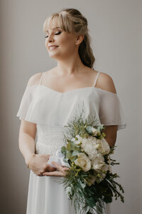
Contemporary headshots and corporate portraits have come a long way. No longer are you limited to having a profile photo that looks like your passport pic (and thank goodness for that!). When planning professional headshots, most people focus on poses, outfits, and expressions. But one of the most important decisions is often overlooked: the backdrop.
The background sets the mood, shapes the overall impression, and even influences how versatile your headshots will be across platforms. From timeless neutrals to unique colours, the right backdrop helps ensure your photos reflect exactly how you want to be seen.
Here are few ideas and some of my favourite set-ups to help you decide what may be best for yourself or for your team.
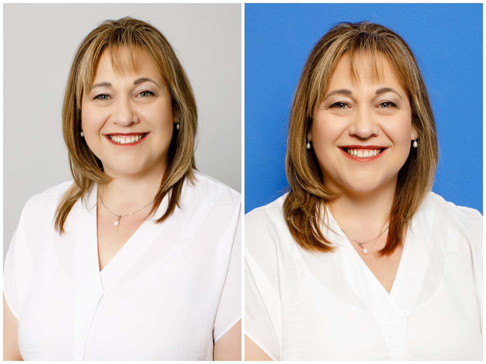
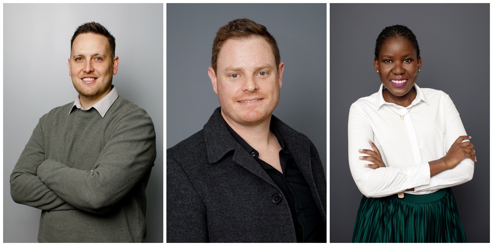
White
White is typically my go-to recommendation for headshots. It’s a versatile background option that with different lighting set ups can photographed to be either pure white, or light grey.
Personally, I prefer the light grey as it gives some depth and dimension to your images, without that “passport photo” feeling. That said, if you’re going to require your images to be deep-etched and placed over other colours or designs, then a pure white set-up is the way to go as it saves the effort of removing shadows later in editing (your graphic designer will thank you!). A white background makes it simple to crop, cut out, or overlay text and graphics if needed.
Why else might you choose a white backdrop? It’s clean and modern, giving you a fresh, minimal look. Many companies prefer white because it’s consistent. It makes your images easy to use across websites, LinkedIn, and all your marketing materials.
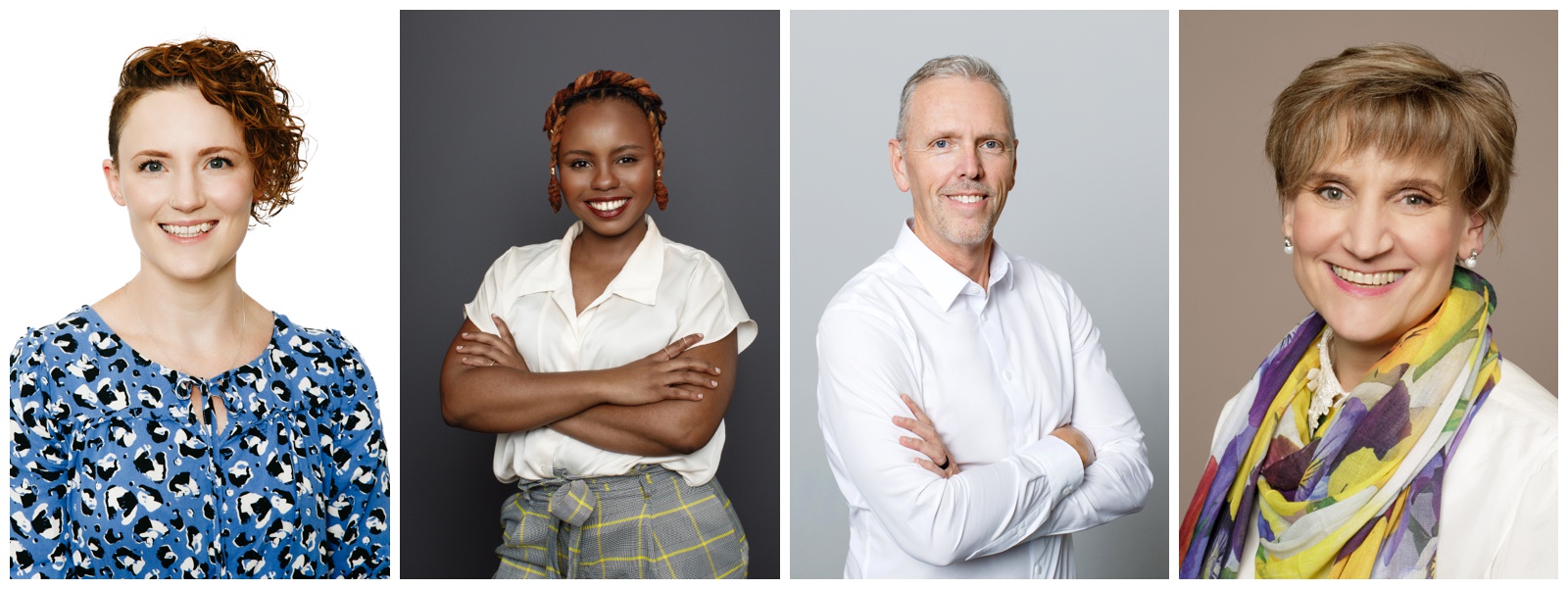
Medium to Dark Grey
One of my personal favourites, this is a modern background option that is great for corporates. It’s also a good option to choose if you are going to be converting your headshots into black and white images. Grey backgrounds strike a balance between being neutral and stylish, ensuring that the focus remains on you while still offering a polished and modern look.
If you want to appear professional yet approachable, grey conveys sophistication without being overly traditional like white or dramatic like black.
Grey backdrops adapt beautifully to lighting. With subtle adjustments, a medium grey can appear lighter, or darker and more “moody” if that’s what you want. A dark grey can create contrast that makes you stand out while still keeping the overall tone professional.
A grey background also complements a wide range of complexions and wardrobe colours, making it a safe and flattering choice – especially if you have a diverse team.
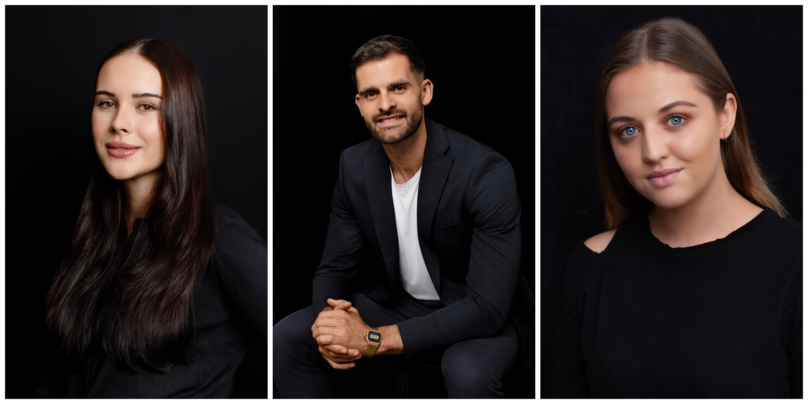
Black
If you’re all about the drama, a black blackground might be the option for you. Black creates strong contrast, drawing full attention to a person’s face and expression. This is why I will always suggest a black backdrop option for acting or modelling portfolios.
You can further emphasise your face by wearing all black too. This is great for high-impact branding. If you want to communicate authority, confidence, or creativity, black delivers a striking and memorable look.
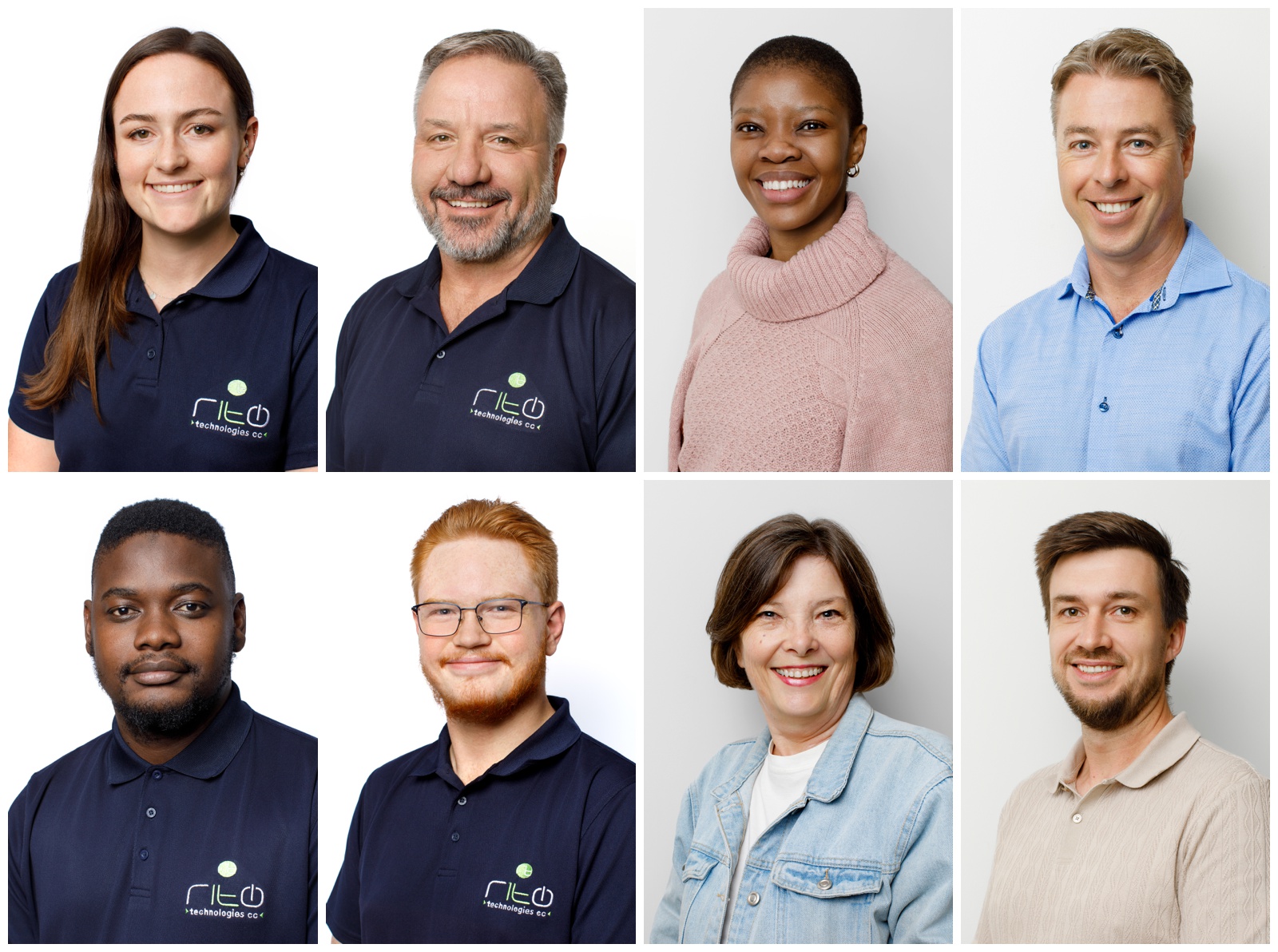
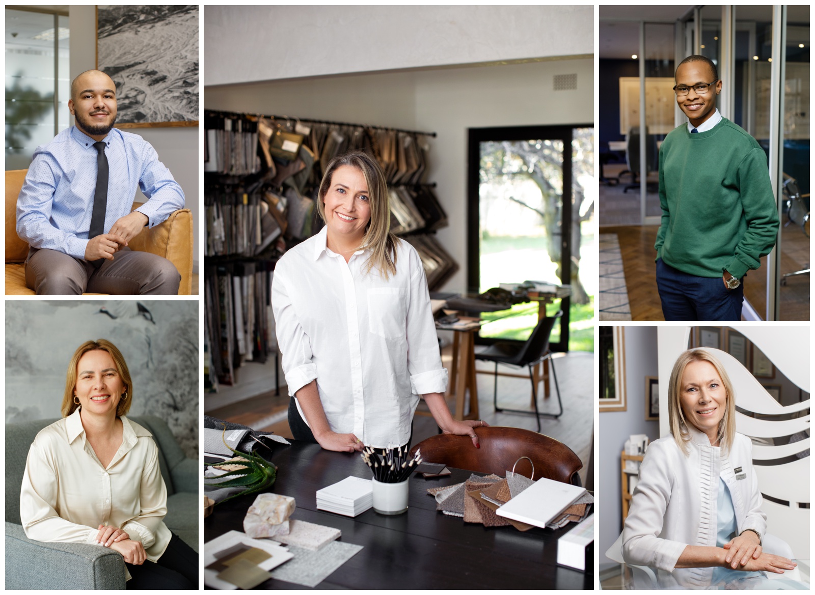
Environmental Portraits
Depending on your requirements for your images, you could also choose to have your office or work environment as a background for the images. If you are only going to be using your images on your website and LinkedIn and would not need them edited for overlays etc, an environmental portrait is a good option that will be unique to you or your company.
A few things to consider when using your environment as the background:
– Will this set-up be repeatable? For example: if you bring new staff members on board, can the same image be created again for a consistent look?
– Will these images become dated? For example: if you take the photographs in a space that includes your company logo, what happens to the images if the logo changes?
If you are considering this option, then I highly recommend everyone in the team wears the same plain colour shirt to ensure consistency. Busy patterned outfits on a busy background take away from you as the subject of the portrait, so I suggest wearing a white shirt if possible instead.
Other Ideas and Colour Suggestions
Depending on the vibe of your brand, you could choose something completely different for your headshots. If your office has a unique wallpaper that stands out and still works with your corporate identity, that’s definitely a creative option to try.
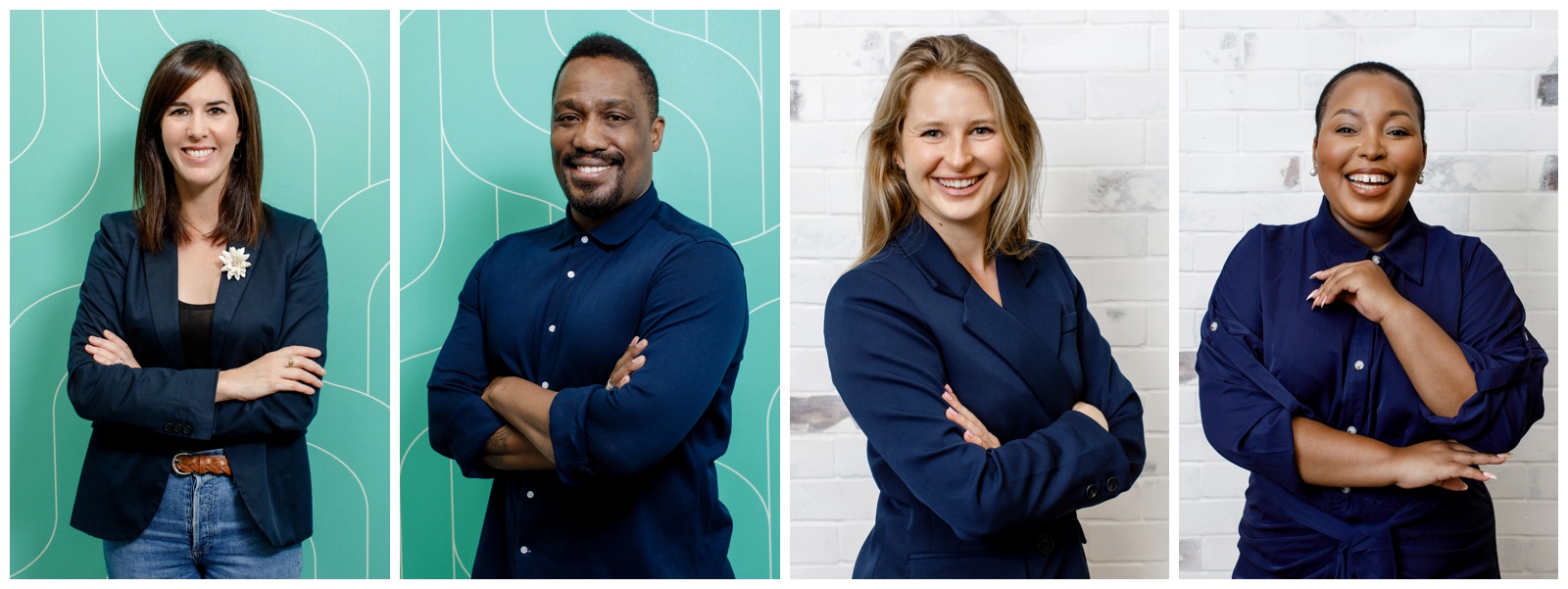
Many companies use their brand colours as a backdrop. Same as with the environmental portraits, make sure the options you choose are repeatable, and give careful consideration to wardrobe choices. You want the background to compliment your portraits and you don’t want your clothing to clash with it.
Hare are some common backdrop colour choices:
Soft Green
- Green is natural and refreshing, giving an organic, calming feel. It’s perfect for brands that want to highlight sustainability, wellness, or creativity.
- Soft sage or muted green feels stylish and contemporary without being overwhelming.
- It’s different enough to feel unique, but still gentle and professional.
Warm Neutral / Beige Backdrop
- This is another option I love as warm neutrals create a softer, more natural look compared to white or black.
- Earthy tones like beige or sand are on-trend and popular in design and branding right now, giving portraits a modern feel.
- Neutral tones are flattering and versatile across diverse skin tones and wardrobe colours, adding warmth without distraction.
Muted Pastels (like lavender purple or blush pink)
- Pastels bring in colour gently, keeping the portrait light and friendly.
- Perfect for industries like design, coaching, or wellness, where approachability and individuality matter.
- Pastels add personality without overwhelming the subject.
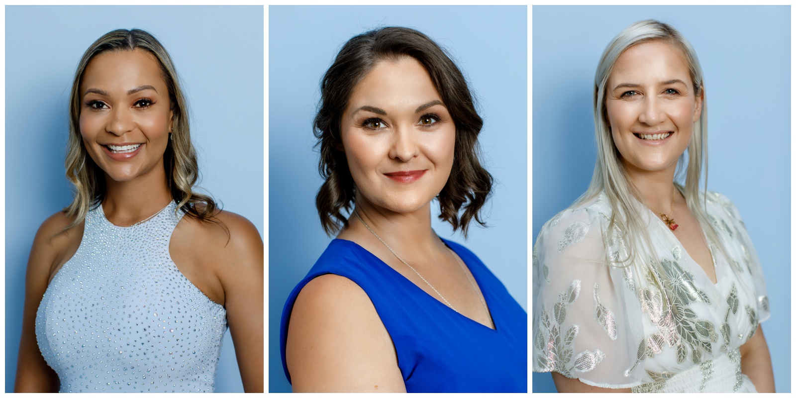
Blue
- Blue conveys trust and confidence. It’s strongly associated with professionalism, reliability, and calmness.
- Blue introduces colour and character, while still keeping the focus on you.
- Personally, I love blue as it complements a wide range of skin tones and wardrobe choices, making it a safe but more interesting alternative to neutrals.
- Blue feels creative and approachable, while still polished and professional. It’s ideal for industries that want to stand out while keeping credibility.
At the end of the day, the “best” backdrop depends on your personal style, your company’s branding or corporate identity, and of course how you’ll use your headshots. Classic choices like grey and white provide timeless, versatile results that work across industries, while black brings the drama! Colours like blue, green, or warm neutrals allow you to express your individual or brand personality in a fresh way.
If you’d like further suggestions on choosing the perfect backdrop or if you’re ready to book a session, I’d love to help create headshots that feel professional, authentic, and truly you.
You can go ahead and contact me here.
Related posts:
Why Professional Headshots are Essential for Your Business
What is Personal Branding Photography?
5 Reasons You Need Professional Headshots